
Language. In the recent years, there has been an emerging focus on the phenotypic characterization of genetic epilepsies and neurodevelopmental disorders. With a rise in large-scale studies leveraging massive and complex genetic and phenotypic datasets, understanding how we make sense of big data becomes critical. However, determining what are clinically meaningful findings and communicating the conclusions we make from these datasets remain a challenge. While we typically think about data in the scope of ‘n’s, probabilities, and p-values, there is understated value in the visualization of information. Here is a different way of how we think about scientific communication and how we can “make data speak in childhood epilepsies.”
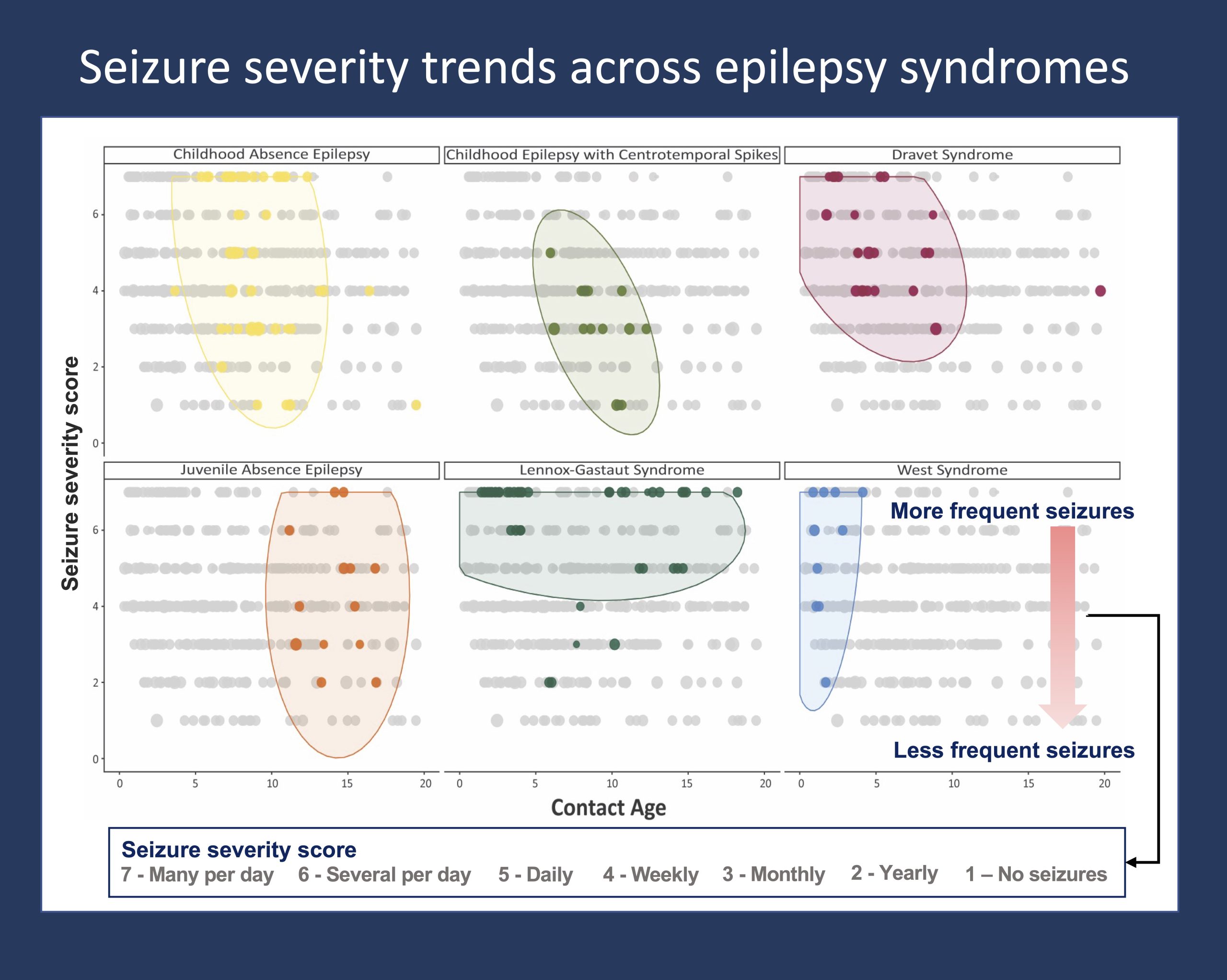
Figure 1. The pattern of seizure severity across the age span is distinctive to and differently distributed between specific epilepsy syndromes. Seizure severity is indicated by seizure frequency data documented from ongoing clinical care across >2,000 individuals with genetic epilepsies. Seizure frequency scores are captured in a standardized framework that can be extracted and analyzed from the Electronic Medical Records. The distribution of seizure frequencies over the age span of individuals with each respective epilepsy syndrome are shown in color, with data points in grey indicating seizure frequencies of other individuals in the overall cohort. The framework for this visualization was published in Fitzgerald et al. 2021.
Phenotypic complexity. The underlying rationale is that the phenotypic and genetic heterogeneity of most childhood epilepsies and neurodevelopmental disorders complicate recognition of clear clinical patterns. Therefore, to overcome the biological variability and to identify the signal amid the noise, we need ways to harmonize and interpret large datasets that capture the complex interplay between genetic factors and clinical presentations. While there are methods to make sense of genomic and high-throughput biological data, there are few established methods for visualizing longitudinal clinical data. Why is the development of such frameworks for mapping clinical data in genetic epilepsies important?
Dimensionality. On one hand, we can think about making sense of individual clinical data points (phenotypic atoms) and clinical endpoints. How do we represent the disease trajectory with regards to the presence or absence of certain clinical features across the age span of an individual? How can we add data on the quantity of seizures per time window and developmental outcomes alongside this information? The idea is that we need a framework for first understanding and simplifying complex, multidimensional datasets; it is not uncommon that we only begin to grasp the value – and limitations – of datasets, or to gain visual intuition, when we start with the elementary descriptive statistics and the graphical display of this information. On the other hand, we need a language to communicate the complexity of the patterns and signals that emerge from our dataset. So, how does this come together in the genetic epilepsies?
Hidden trends. To objectively investigate the landscape of genetic epilepsies, we typically try to let the data speak for itself. While we may approach the data with preconceived ideas or pointed hypotheses, the actual content and substance of the study should be rooted in what the data says and shows us. The necessity of this approach becomes apparent when investigating entire disease landscapes of disorders such as STXBP1-related disorders, in which prior knowledge can be limited by clinical variability or lack of recognized genotype-phenotype associations. Furthermore, visualizing the data allows us to move beyond the binary of significant versus not significant results to instead characterize the findings by themselves. We can quantify and compare the relative risk of certain clinical features or the relative effectiveness of specific treatment strategies. Or we can demonstrate the dynamic and unique progression of seizures that is characteristic of specific epilepsy syndromes, as shown in Figure 1.
Storylines. Prior to writing out the results of our studies, our group will typically start the manuscript process by first drafting the figures. The idea is that the figures will form the skeleton of the manuscript – coming up with the figures creates the space for conceptualization, and it guides us to think about the main messages and take-aways. It all depends on the story that the data tells us. In brief, conceptualizing figures both develops and sets the storyline of the manuscript. Accordingly, our group has spent significant effort on building data visualizations, such as phenograms for mapping the overall constellation of clinical features within a genetic subgroup compared to the cohort and the “hurricane plot” for conveying the enormity of EMR data.
What you need to know. In a data-driven world, there is understated value in the way we make sense of complex datasets and communicate clinically meaningful information. Clear delineation and precise understanding of patterns and trends hidden within multidimensional datasets in the genetic epilepsies and neurodevelopmental disorders will be critical for choosing appropriate treatment strategies and advancing clinical care. Developing frameworks for how we process information, including how we visualize and conceptualize clinical data, can guide research efforts, standardize computational phenotyping, and ultimately generate translatable knowledge that will inform clinical decision-making.
Julie Xian is a Data Scientist in the Helbig Lab at Children’s Hospital of Philadelphia (CHOP).
